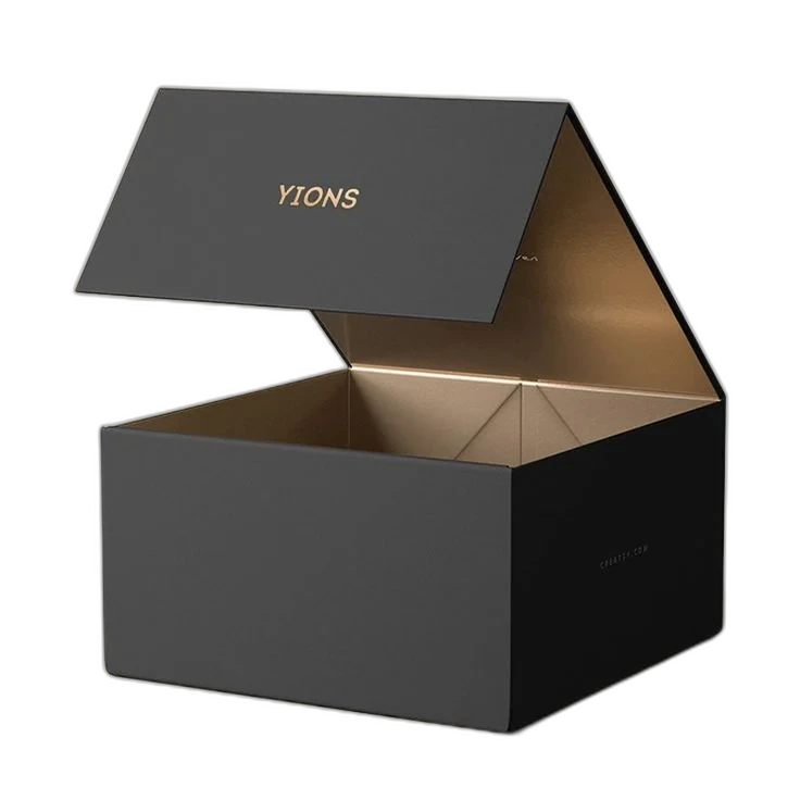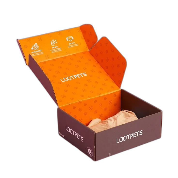
A mailer box is the only piece of marketing every single customer touches. It arrives at their door, it gets opened on camera, and it either looks like your brand or it looks like a shipping carton with a logo slapped on it.
The difference is rarely budget. Most of the mailers that get reshared were designed with the same print methods and stocks as the ones that get recycled unnoticed — they were just designed around the box instead of on top of it. Here is what we tell brands before they send us artwork.
Key takeaways
- Design on the dieline, not on a flat rectangle — panels fold, scores crease, and glue flaps get covered.
- The inside of the lid is the single highest-value surface on a mailer, and printing it is cheap.
- Digital print suits small runs and versioning; offset and flexo win on cost once volumes climb.
- Kraft absorbs ink and shifts colour warm — proof on the actual stock before you commit.
- Order a physical sample. A 3D mockup cannot tell you how a fold feels in the hand.
1. Start with the dieline, not the artwork
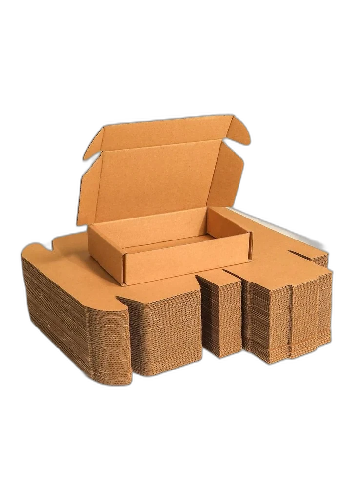
A dieline is the flat blueprint of your box: every panel, score, glue tab, and cut shown in position. Design without one and you will discover that your logo lands across a fold, or that the panel you built the whole layout around is the one that faces down inside the shipping bag.
Ask for the dieline before you open a design file. We supply one free with every quote, and it will tell you exactly how much usable space each panel really has once you account for folds and tolerances.
- Keep critical artwork 5mm clear of every score line.
- Extend background colour past the trim edge as bleed so a slight cutting shift never shows white.
- Mark which panel is the lid — it is the first thing the customer sees.
2. Print the inside of the box
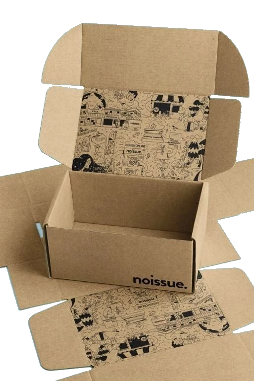
Inside print is the cheapest upgrade in packaging. The box is already running through the press; adding interior coverage is an incremental cost, not a new job. And it is the surface that appears in every unboxing photo, because the lid is open in every unboxing photo.
You do not need full coverage. A single strong colour on the inside of the lid, or one line of copy where the product used to be, changes the whole moment. Brands that print the outside only are paying for the box and skipping the part that gets photographed.
3. Match the print method to your run size
Print method drives both cost and colour fidelity, and the right answer depends almost entirely on how many boxes you are ordering.
| Method | Best for | Trade-off |
|---|---|---|
| Digital | Small runs, seasonal designs, multiple SKUs in one order | Higher unit cost at volume |
| Offset litho | Mid to large runs needing sharp detail and tight colour control | Plate setup cost per design |
| Flexo | High-volume corrugated with simpler, bold artwork | Less suited to fine gradients and small type |
4. Keep logos and faces off the score lines
Anything that folds gets a crease, and a crease through the middle of a wordmark or a model's face reads as a mistake even to people who could not explain why. Board also cracks slightly along heavy scores, which is most visible in dark, saturated ink.
Move the logo. Use the fold as a deliberate divider between two blocks of colour instead of pretending it is not there.
5. Design for how colour behaves on kraft
Unbleached kraft is brown, absorbent, and uncoated. Ink sinks in and every colour shifts warmer and darker than it looked on your screen. Pale blues turn grey, whites disappear entirely because there is no white ink in a standard CMYK run.
If your palette depends on brightness, use a white or bleached board. If you want the recycled, natural look of kraft, design a palette that works with brown as a base — earth tones, deep greens, blacks, and single-colour line art all hold up beautifully.
6. Give the opening a moment
The best unboxings have sequence: something happens, then something else. A tear strip that opens cleanly. Tissue and a sticker before the product. A short line of copy on the inside flap. Each layer buys you another second of attention.
Keep it proportionate to the product. Three layers of tissue around a phone case reads as waste, not luxury.
- Tear strips make opening effortless and feel engineered.
- A branded sticker or sleeve holds tissue closed and adds a beat before reveal.
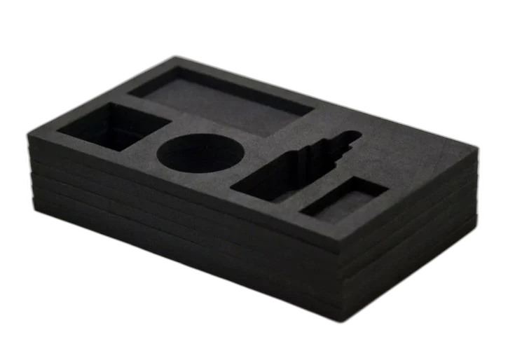
- Inserts stop the product rattling and hold it in a photogenic position.
7. Set type bigger than you think you need
Packaging is read at arm's length, in a hallway, in bad light — not zoomed to 200% on a calibrated monitor. Fine 6pt copy and hairline rules that look elegant on screen turn muddy on uncoated board.
Increase weight and size, then check the proof at actual size before approving. If you cannot read it standing up with the box on a table, your customer cannot either.
8. Use finishes on one thing, not everything
Foil, spot UV, and embossing work because they contrast with the surface around them. Foil the logo and it reads as premium. Foil the logo, the border, and the pattern and it reads as busy — and costs considerably more, because each finish is a separate pass on press.
Pick the single element you want people to touch, and let everything else stay flat.
9. Remember the box has to survive a courier
A mailer is a shipping container first. Corrugated flute choice decides whether your artwork arrives crisp or scuffed. E-flute is thin and prints beautifully, so it suits retail-facing mailers; B-flute is thicker and takes more abuse in transit.
Dark, heavily inked exteriors show every scuff and fingerprint. If your boxes ship long distances, a matte laminate or a lighter base colour will look considerably better on arrival.
10. Order a sample before you order five thousand
A 3D mockup will confirm your layout. It will not tell you whether the board feels substantial, whether the lid closes with a satisfying snap, or whether your brand green printed the way you imagined on that stock.
Get a physical sample of the final construction and stock, put your actual product in it, and photograph it on your phone. That test catches more problems than any amount of on-screen review — and it is far cheaper than a full run you have to reprint.
Frequently asked questions
It is one of the cheapest upgrades available, because the box is already running through the press. Interior coverage adds incremental ink and setup rather than a separate job, and it is the surface most visible during unboxing.
Want this reviewed on your own project?
Send us your product details and our team will recommend a construction and stock, supply a free dieline and 3D mockup, and price two or three options — within 24 hours.